My recently painting New Century’s Shangri-La is rather visually intriguing — a colorful and orderly semi-abstract landscape/cityscape, serene and paradisal, being menaced by heavy dark storms swirling above, which threaten to crush down at any moment and bring havoc to the orderly world below. The ironic title unfortunately aptly described the state of our world, if not yet today, soon tomorrow.
New Century’s Shangri-La Oil on Canvas 30″ x 24″ Completed in 2017
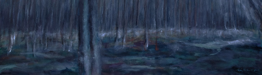
The inspiration of my 2017 oil painting, Autumns Impression was a photo I chance encountered – a room of eerie green light, resembling electric currents, against a background of a irregular pattern of wavering pink tiles. Besides the striking color palette, I was also intrigued by the shifting spatial relationship between the light and the background, thus moved to commit my appreciation to canvas.
Naturally, I would not ape the photograph; rather, the photo served as a springboard for me to “record” my vision. The painting soon departed from the electric glow, and morphed into an impressionistic abstract landscape, and reached a state that I could stop and consider the project complete, though the painting was not truly satisfying.
With layers of additional paints applied to the canvas, it moved further away from the inspiration and my initial attempt. Now, the colors of painting somewhat recalled what I saw in Yosemite National Park I visited last fall, therefore, a new resolution presented itself and I happily complied.
I managed to find the good balance of recalling the spirit of a slightly unhinged forest or meadow, softened by some darting patches of rather joyous colors, without being slavishly realistic. It’s a recollection of memories and emotions. The spatial relationship of many elements and colors of the painting, though not the same as the photograph, was also similarly intriguing.
Autumn Impression
Oil on Canvas
36”x18”
Completed in 2017
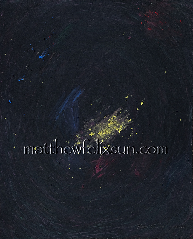
The first painting I completed in 2017, Origin, was an abstract gouache painting, with yellow dusts scattered on a very dark background — red and blue streaks intermingled with swirling thin layer of black paint. A striking contrast and beautiful presentation, perhaps depicting the beginning, or end of the time.
Origin
Gouache on Paper
10”x8”
Completed in 2017
The inception of this piece was a strange one. It was inspired by my aged, multiple-layered, and simultaneously muddied and rich-hued palette. A small vision triggered a larger one.
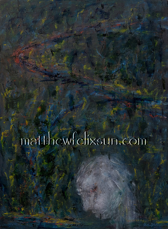
My last oil painting completed in 2016, Remembrance, featured a ghostly profile of a pale and pensive person, occupying lower third of the canvas, head bending down, in deep thoughts, with a barely registered presence. Against this sketchily and thinly painted bust, the strongly accented abstract and dark background, asserted itself strongly, and became obvious the representation of the things to remember, a commentary to his thoughts. Perhaps, the winding road or river in the far background reminded him of the toil in the past; perhaps, the repeating pattern of vertical shapes, reminded his of the hopes raised in the past and perhaps not wholly accomplished, or even lost. An apt conclusion to a quite regrettable year of the turbulent 2016.
Remembrance
Oil on Canvas
24”x18”
Completed in 2016
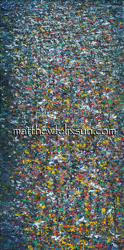
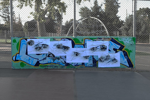
Recently I created an installation Wilting Flowers and fully documented the creation and installation processes.
This new effort was spurred by my continued fascination with paper material – delicate, malleable, and transitory, characteristics well suited for hinting at, versus representing, a world full of fragility and vulnerability, constantly under the threat of total destruction.
My local newspaper, “The San Francisco Chronicle”, served as the foundation: a segment of our time, distilled and encapsulated. Inky strokes and splashes were added to the newspaper sheets, which were folded and tied up to form large flowers, with aluminum wires wrapped with dyed twine as stems.
For the background, I chose five sheets of plain white paper, streaked with similar black strokes of ink diluted with various amount of water.
To install, I attached these background paper to a wall in an uneven row, then affixed those flowers, 13 total, to those sheets. There were no strict rules about how to lay out the background sheets and flowers, as long as the finished installation looked balanced, and the flowers largely faced outwards.
I have installed these sheets and flowers on different surfaces – a colorful graffitied plywood wall, or somber looking wooden fences, at different times of the day. The differences between the surfaces, the different light cast on the wall or fence, background sheets and paper flowers, all contributed to a murmuring polyphony.
Wilting Flowers
Ink on paper and newspaper, aluminum wire, cotton string
40″ x 140″ x 5″
Completed in 2016
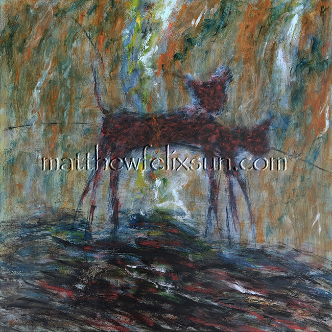
The motive behind my oil painting Trot was my wish to explore tonal contrasts and arrive at a certain balance of playfulness and menace.
The subject of this study is a cat, or two. Before I started my oil, I made several preliminary sketches and once I committed my ideas to the canvas, I proceeded with a cat with upright head. Somehow, after the composition had more or less taken shape, I noticed a more dynamic and emotional sketch with a cat whose head was bending down, thus I incorporated that cat into the canvas.
Trot / 小跑 / Trab Oil on Canvas 22″ x 22″ Completed in 2016
The finished painting more or less achieved my goals, though the subject can be seen as two cats running side by side, or just a cat captured at different time.
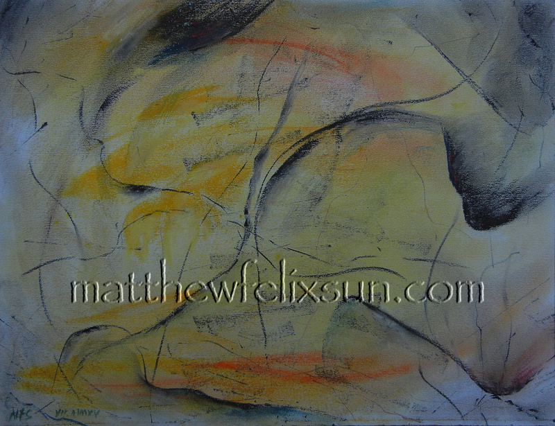
My first successful pastel painting, Typhoon, is an abstract piece inspired by devastating typhoons unfortunately have been creating ever-heavier havoc recently, due to the undeniable climate change. Exploring spatial relationships, subtle variations of tones and shifting of patterns, I tried to capture the something unpredictable and the menacing. Typhoon / 颱風 / Taifun Pastel on Paper 8.5” x 11” Completed in 2015
This painting is currently being exhibited at Expressions Gallery in Berkeley, in a show aptly titled “Into the Future”.
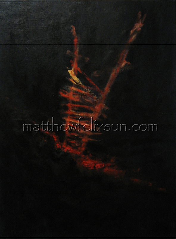
Though I am mostly comfortable in descriptive paintings, occasional visions have compelled me to explore abstract paintings, such as this Schism.
Schism Oil on Canvas Board 16″ x 12″ Completed in 2007
The straightforwardly titled painting is dominated by a large object, glowing red and yellow, sitting on top of an equally glowing red slit – the schism, all of them contrasting strongly against the black background. Smack in the middle of the small canvas, the large object can be seen as an escaping ladder, or a doomed arrow headlong crashing into the schism; or, can even be interpreted as the vary agent who caused the schism, with some tragic results for the environment and perhaps even itself, similar to the reckless behavior of the US on the international stage in the last decade, in particular.
This painting, in stark contrasting bi-tones, together with Flow and Party Night, would be exhibited at Expressions Gallery, Berkeley, in an exhibition titled “Does Color Matter?” (October 24, – January 8, 2016 Opening: October 24, 6-8pm).
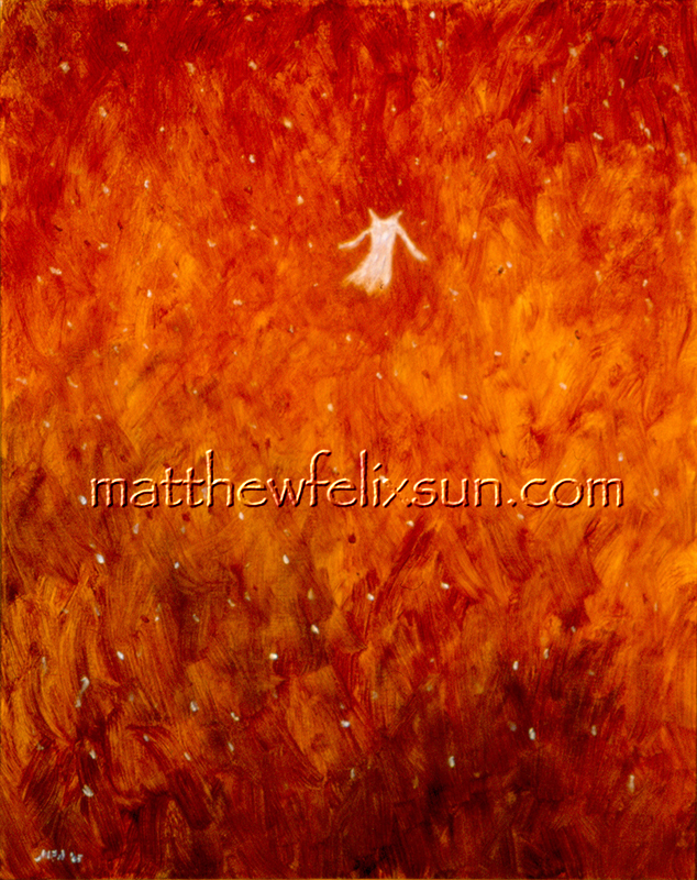
My still life oil painting, “White Dress”, was inspired by a vision of a tiny white dress floating in a vast open sky.
While working on the painting, I managed to make the delicate-looking dress full of free-spirit and bravura, as it floated against an intense red backdrop, whose hues shifted and varied mercurially, like raging flames. Small, and delicate, yet the small white dress flew on, nonchalantly, unconcerned with its own vulnerability, however threatened by the menacing environ.
The success of this painting gave me an impetus to continue the probe of the psyche of a personified white dress, and embarked on a journey of making a series of white dresses, objects I judged perfect to reflect or stand in as the bodies they are to clothe, as documented in this article: “White Dress” Series Continues – A New Drawing and a New Painting.
It was selected for juried exhibitions at 4th National Juried Exhibition, Prince Street Gallery, Chelsea, Manhattan, New York, 12 – 30 July 2011, and ViewPoint 2007, 39th Annual National Juried Art Competition, Cincinnati Art Club, Ohio, November 2007.
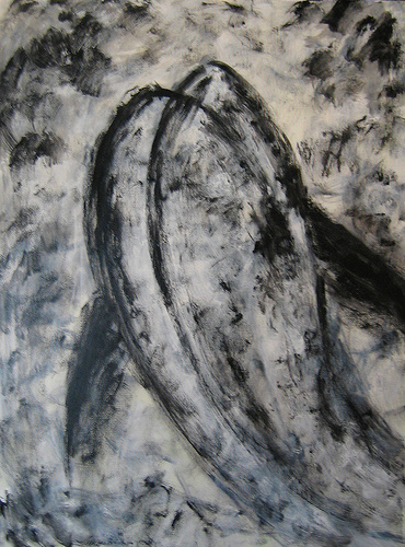
Last week, I shipped to Seattle my 2008 oil painting, Upstream, which has been selected for the juried show, 2014 Evergreen Association of Fine Arts (EAFA) Open Exhibition, at EAFA Gallery in the Seattle Design Center (5701 Sixth Avenue South, Suite P292, Seattle, WA 98108).
This modest painting, measured 24″ by 18″, semi-abstract in style, clearly influenced by Chinese ink painting, depicts a fish or two struggles to swim upstream, against the current. It is fitting for the painting to travel to Seattle, because it was in that city when I witnessed an amazing salmon run in Chittenden Locks Fish Ladder several years ago.
Upstream oil on canvas, 24″x18″, 2008
This painting was not a frank documentation of that fish ladder scene; rather, when I painted it, I was trying to capture a free spirit, a spirit to overcome adversaries. I deliberated chose a black and white color scheme, and a bold, almost abstract outline, as I was mostly interested in something elemental, less representational.
This work surely has a charmed life and earned a fair bit of recognitions – in 2009, it was published in The William and Mary Review by The College of William and Mary, Virginia, Volume 47.